A statistical measure of how far two variables move together. It is among the most widely used quantities in research and among the most widely misread, principally because association is routinely taken for causation.
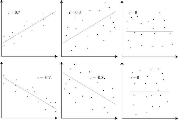
The Pearson correlation coefficient runs from minus one to plus one.
Plus one means the points lie exactly on an upward straight line. Minus one means exactly on a downward one. Zero means no linear relationship.
Intermediate values describe how tightly the points cluster around a line. A coefficient of 0.7 indicates a fairly strong linear relationship and considerable scatter.
Squaring the coefficient gives the proportion of variance in one variable that is accounted for by the other, which is generally more informative. A correlation of 0.5 accounts for a quarter of the variation, leaving three quarters unexplained, and correlations described as moderate frequently account for very little.
Rank-based measures, including Spearman's, assess whether variables move together in order rather than linearly, and are used where the relationship is monotonic but not straight.
The most important limitation is that the standard coefficient measures linear association only.
A perfect relationship that is not a straight line can produce a coefficient near zero. Points arranged on a symmetric curve have a strong deterministic relationship and no linear component.
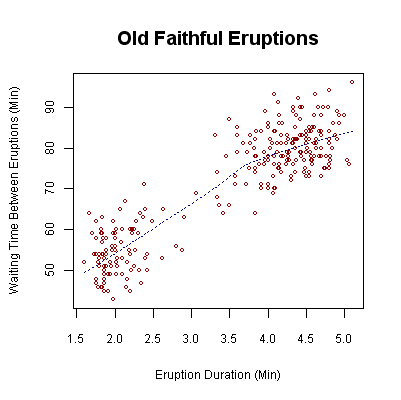
Anscombe's quartet demonstrates the point directly: four datasets with identical means, variances, correlations and regression lines look entirely different when plotted, one containing an outlier that drives the entire result.
The practical rule is that a correlation coefficient should not be reported without a plot, because the number describes one feature of a relationship and the plot shows the relationship.
Outliers exert substantial influence. A single extreme point can create or destroy an apparent correlation, particularly in small samples.
Restricting the range of a variable reduces the correlation, which is why studies of selected populations understate relationships that hold more widely.
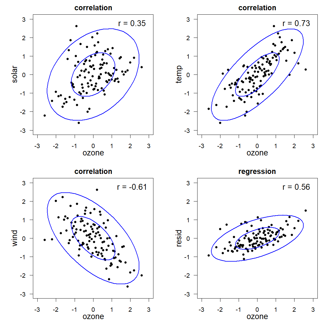
Two variables may be associated for several distinct reasons.
One causes the other, which is the interpretation usually assumed.
The second causes the first, which is reverse causation. Studies finding an association between exercise and health must contend with the possibility that healthy people exercise rather than exercise producing health.
A third factor causes both, which is confounding. Ice cream sales and drowning deaths correlate because both rise with temperature, and neither affects the other. Confounding is the most common explanation for spurious associations in observational research.
The association arises from how the sample was selected, which is collider or selection bias, and it can produce correlations in a sample that are absent or reversed in the population.
Chance, particularly when many relationships are tested. Testing enough pairs of variables guarantees strong correlations by coincidence, and collections of absurd examples, such as national cheese consumption tracking deaths by bedsheet entanglement, are assembled by searching large numbers of series for coincidental matches.
Randomised experiments are the strongest method. Assigning treatment at random breaks the link between the treatment and any confounder, which is precisely what randomisation is for.
Where experiment is impossible, several approaches are used, none as strong.
Natural experiments exploit circumstances that assign exposure in a manner approximating randomness, including policy changes affecting some regions and not others.
Instrumental variables use a factor affecting the exposure and not the outcome except through it.
Statistical adjustment for measured confounders is standard and can only address confounders that were measured.
The Bradford Hill considerations, developed to assess whether smoking caused cancer, set out features that strengthen a causal interpretation, including strength of association, consistency across studies, a dose-response gradient, correct temporal order and a plausible mechanism. They are not a checklist and are a reasonable structure for the argument.
Correlation is the entry point to most quantitative research, and the inference from it to causation is where most misinterpretation of research occurs, in the press and in the literature.
The most useful practical habit is to ask what else could produce the association before accepting the causal reading, and to note that the researchers themselves usually raise those alternatives in a section that reporting rarely reaches.